
New Zine/Newspaper
My Polaroid Emulsion Lift / Ink Painting Project

A Little Backstory
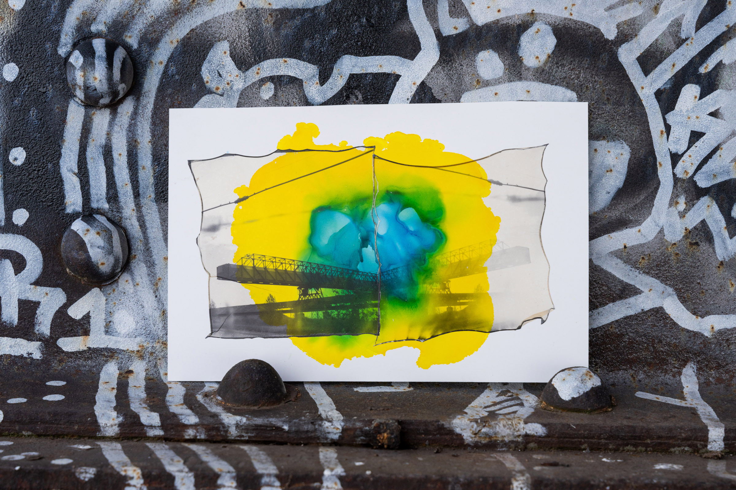
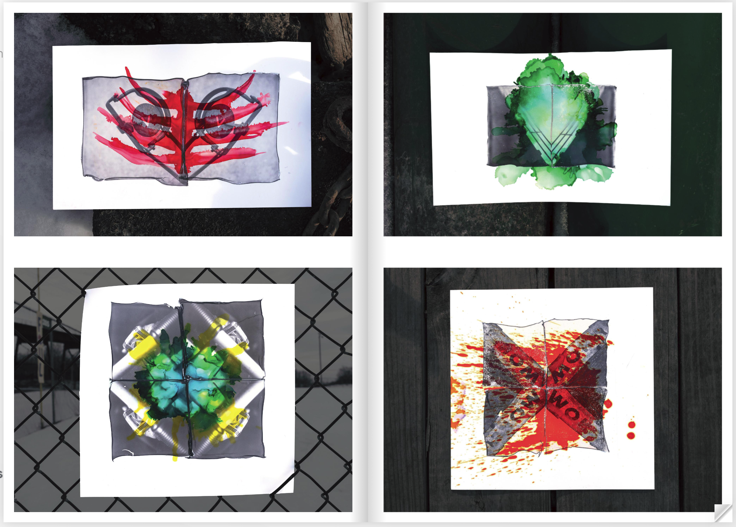
A few years ago I started a new photography project which I ended up calling, "Lifted Dreams." It was my main project for about a year and a half and it represented a bit of a reset for me with my photography. I won't get into the whole backstory of the project, but in a nutshell, it combines ink paintings with the emulsion layers of Polaroids to create semi-abstract, semi symmetrical images. The creation of each of these is a completely analog process.
Here is a short video I made showing the process:
Showing these pieces in a digital format has never quite worked for me; it can be sort of hard to tell what you are looking at on a screen. The edges are not perfectly cut, there is texture, and they are a bit rough. Digital formats require there to be precise edges and something was lost in the scanned versions, so I knew I wanted to try something else.
Zine/Newspaper
I've always been intrigued by different printed formats for presenting work and zines have been on my mind for a long time. A while back I made a limited run of zines featuring another project and was very happy with how it turned out. And with all of the talk about zines on Substack recently, I decided to not overthink it and experiment with making one for this project as well.
Layout
A while back I watched the David Carson Masterclass and it really liked what he had to say. His style and rejection of grids and rules in graphic design stod out to me. I ended up getting a couple of his books and they were an inspiration in how I approached this piece.
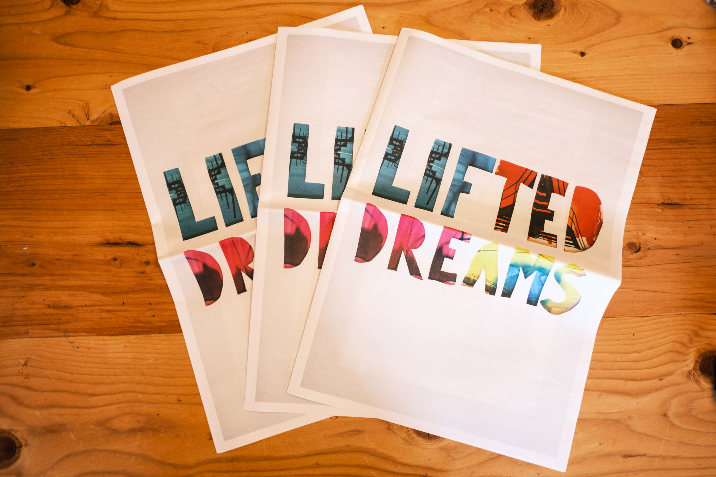
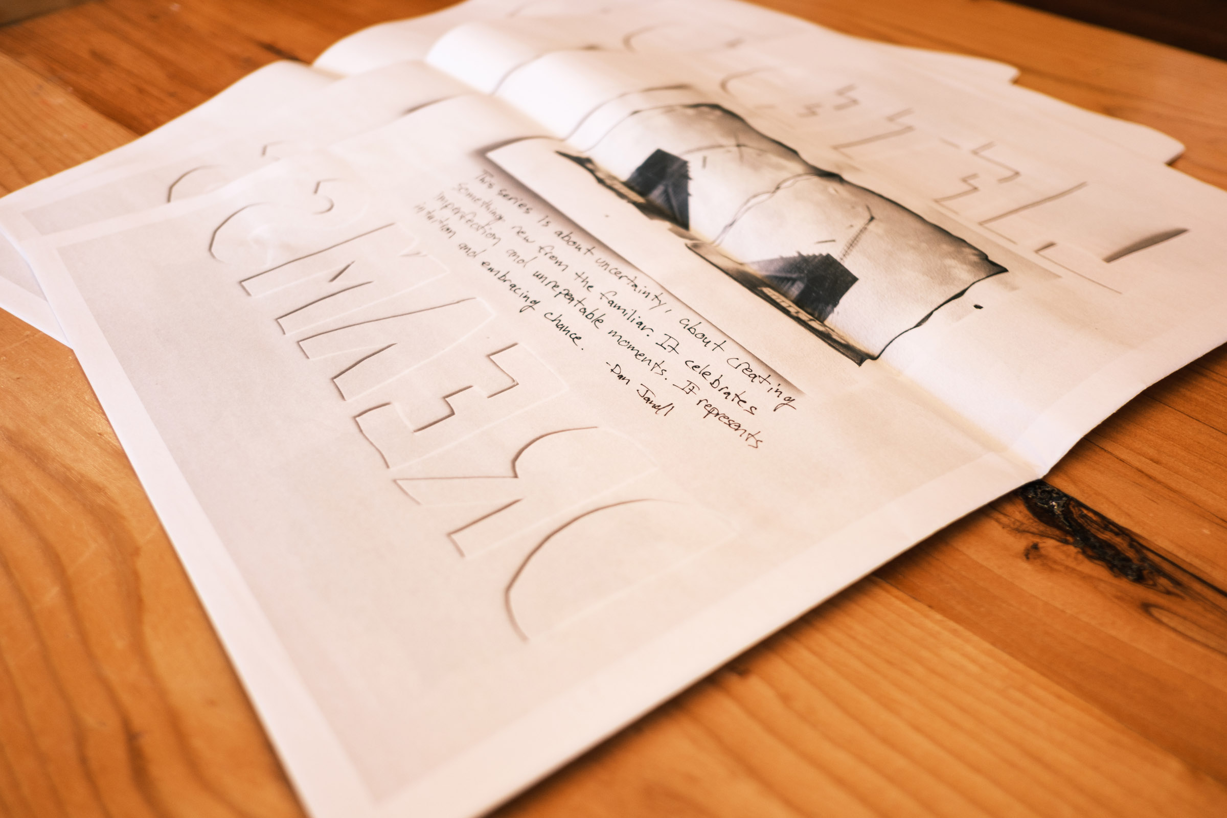
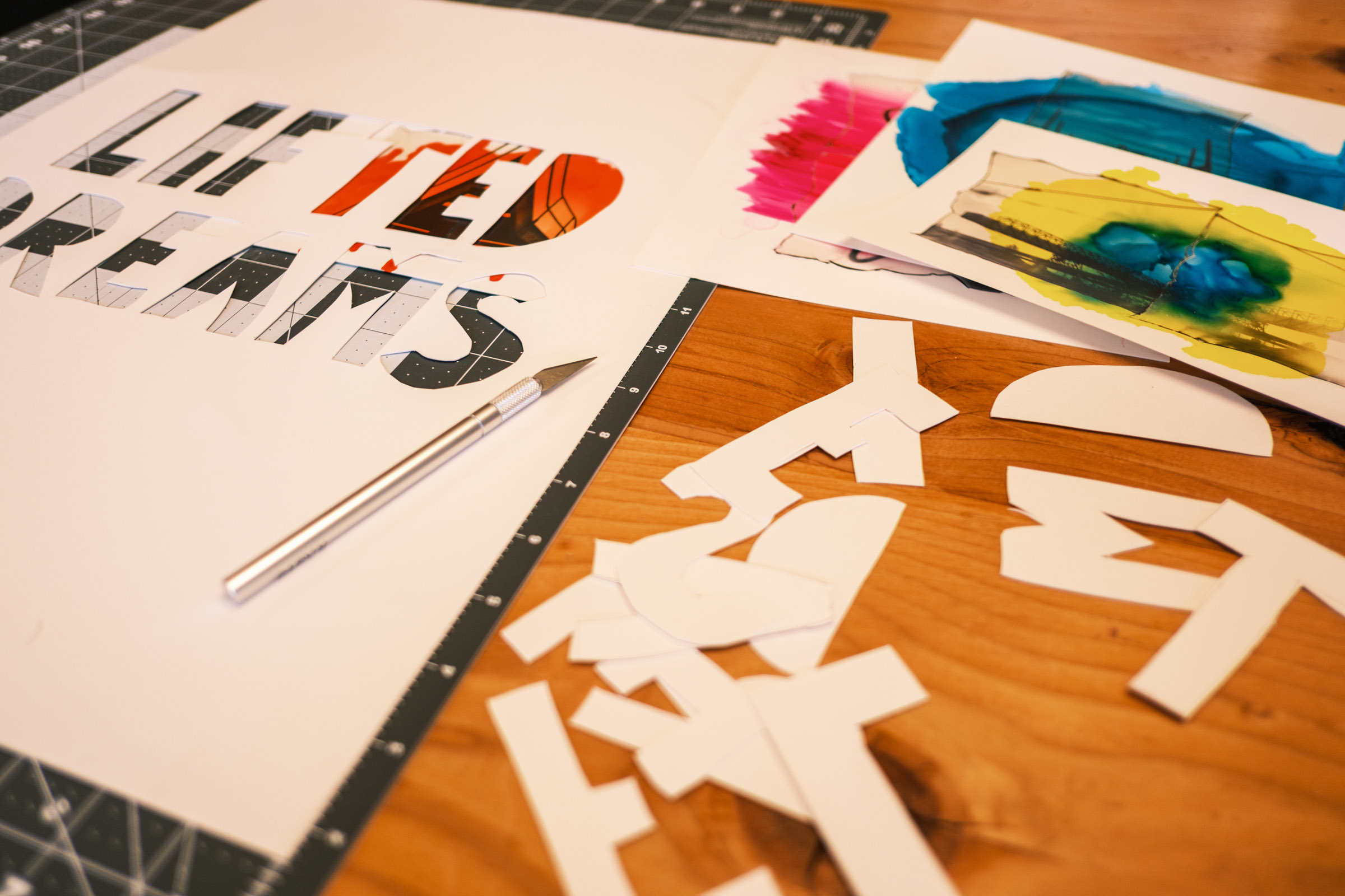
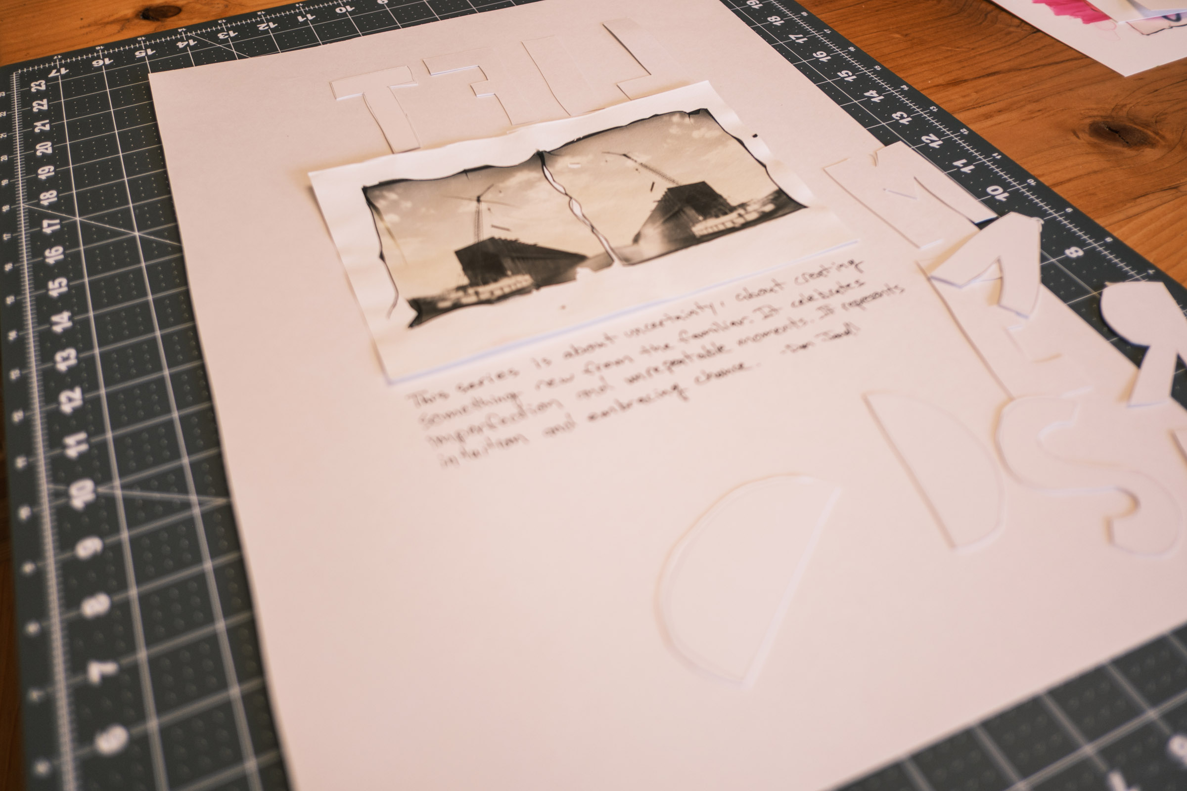
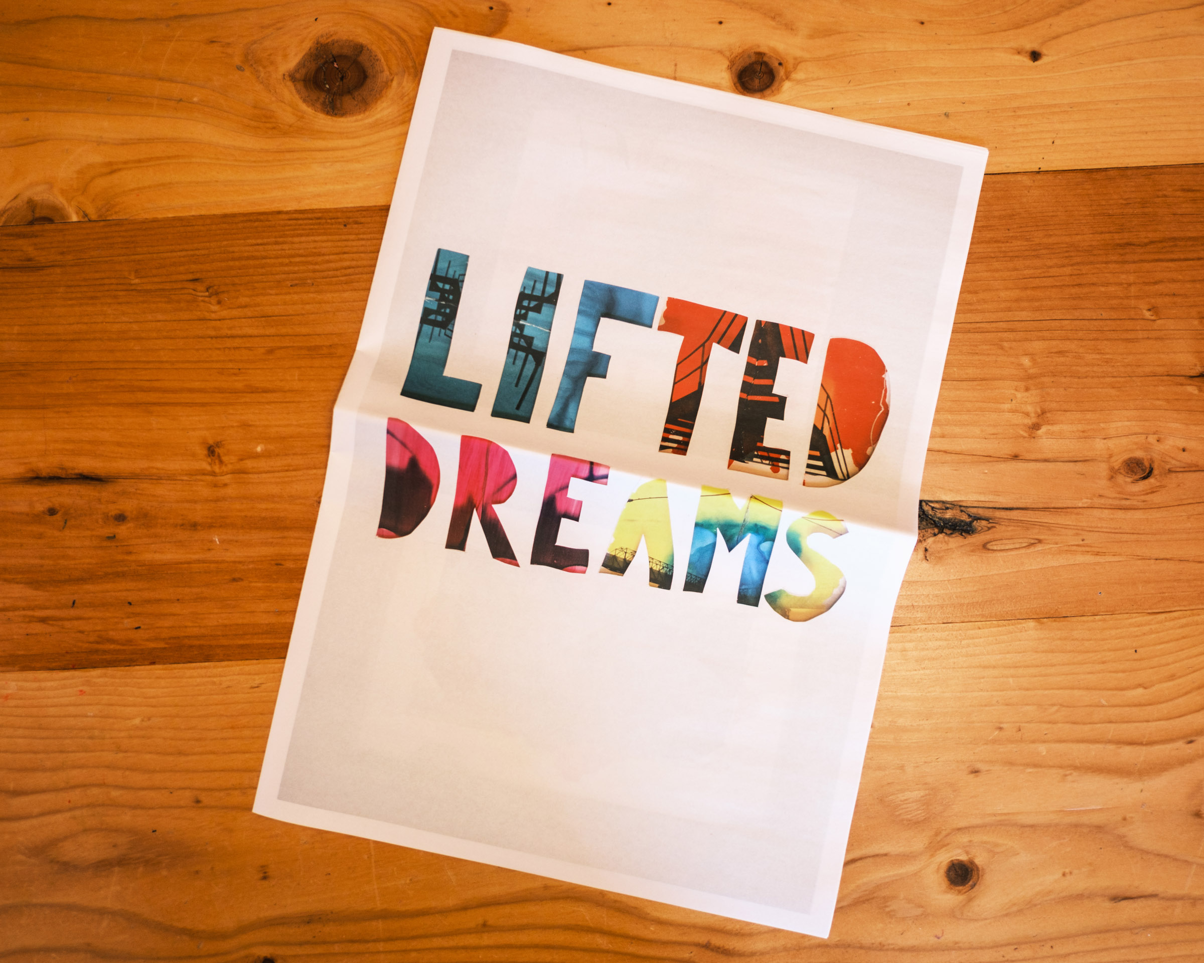
For the cover, I decided to cut the words "Lifted Dreams" out of a large piece of poster board with an X-Acto knife and then photograph it with pieces from the series layered underneath. For the back cover, I took those letters that were cut out, reversed them as a nod to the symmetry of the pieces in the project, and laid them out on a large piece of paper. I then added the first image I created in the series (without ink) and a few handwritten words about the project and photographed the whole thing.
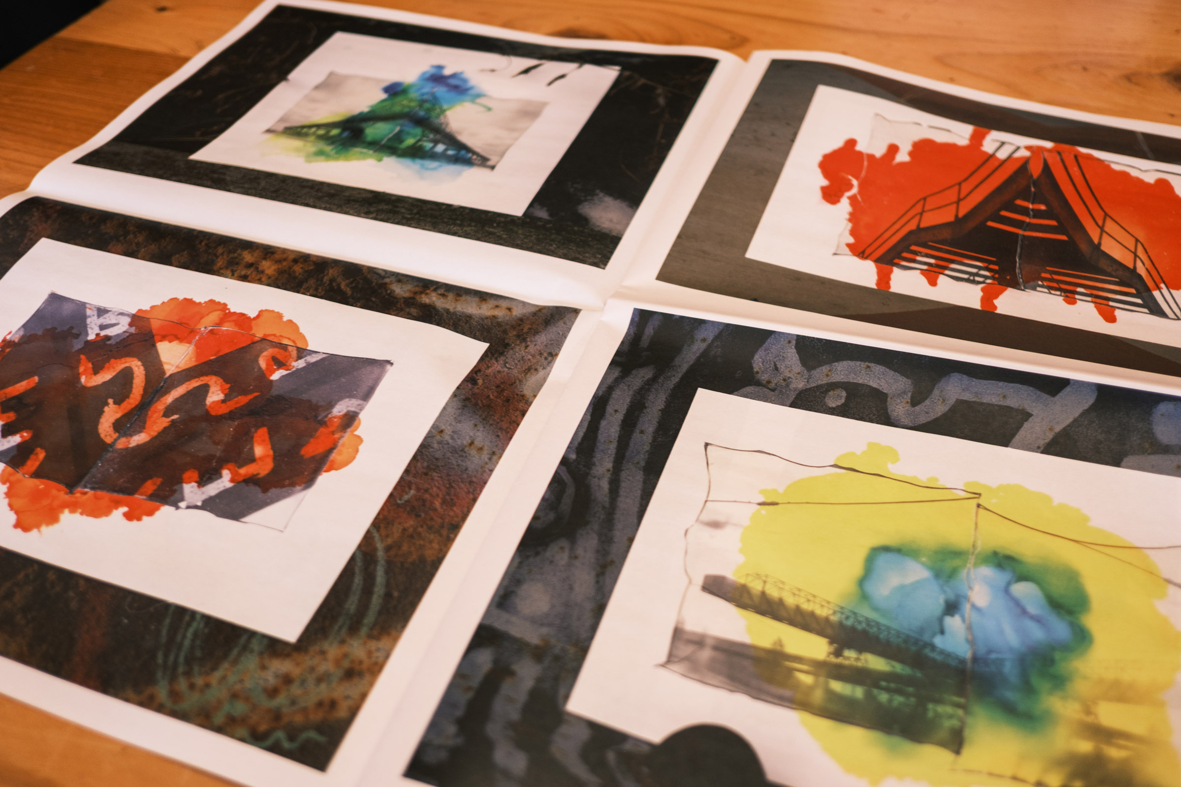
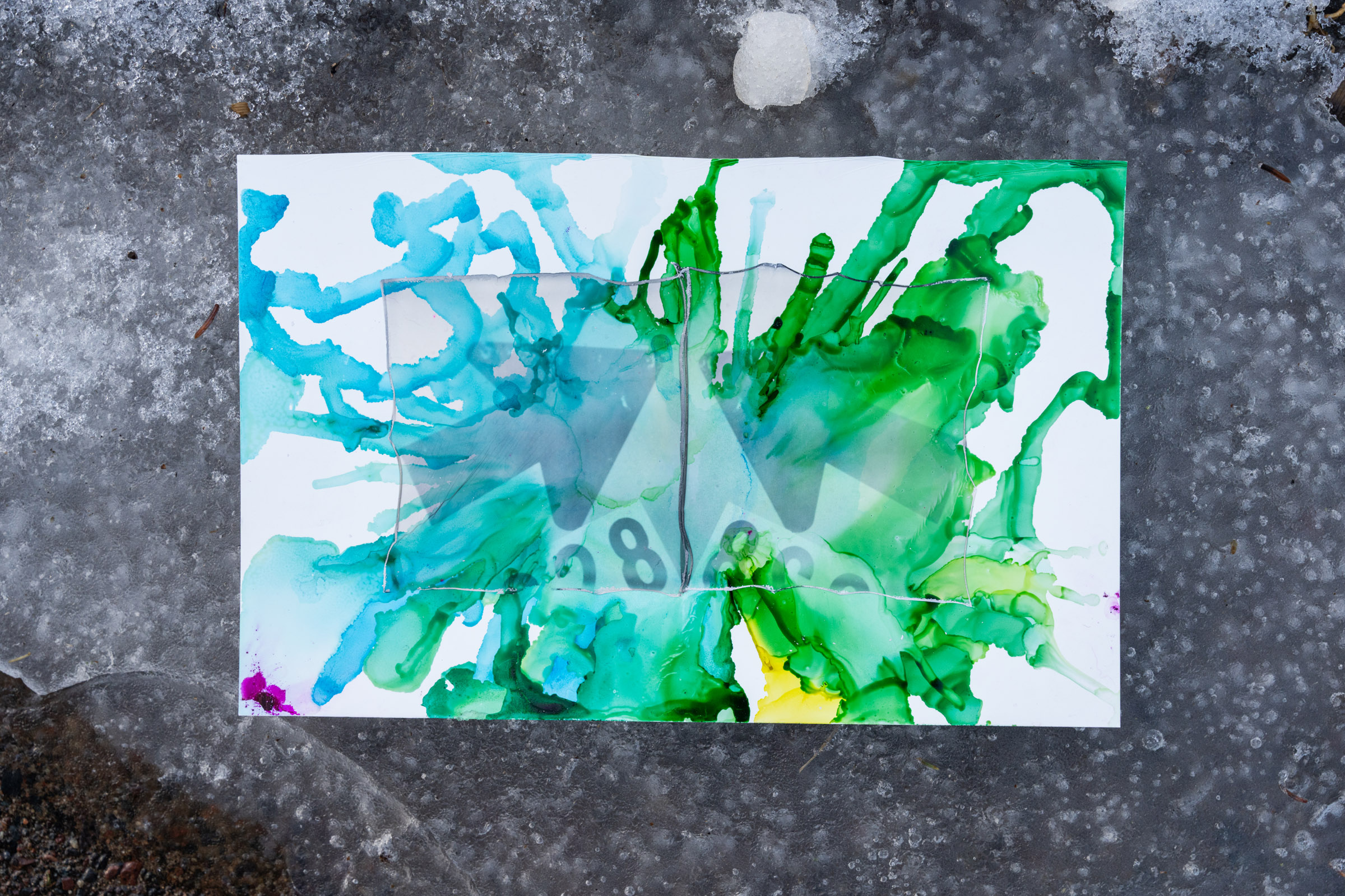
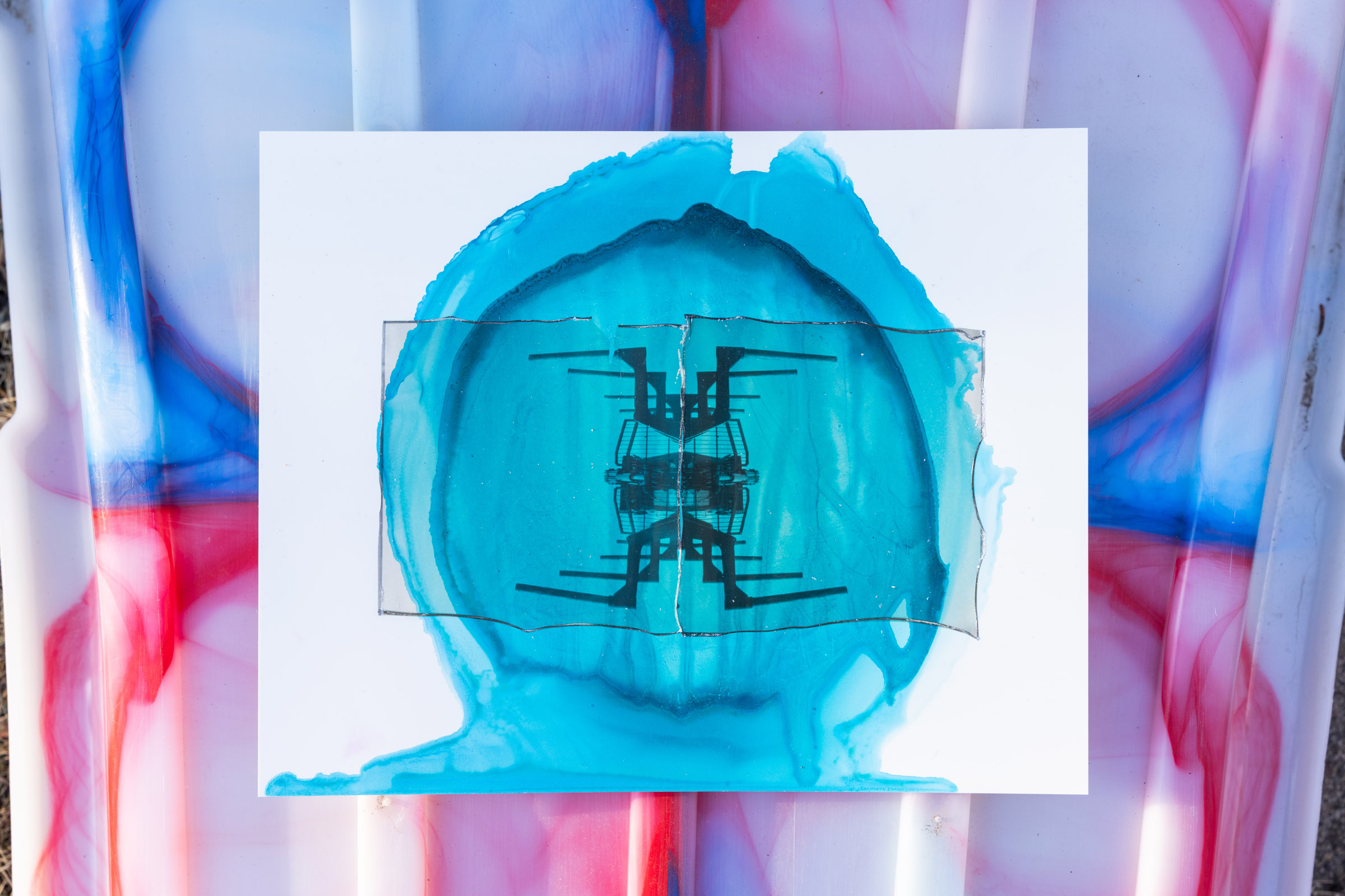
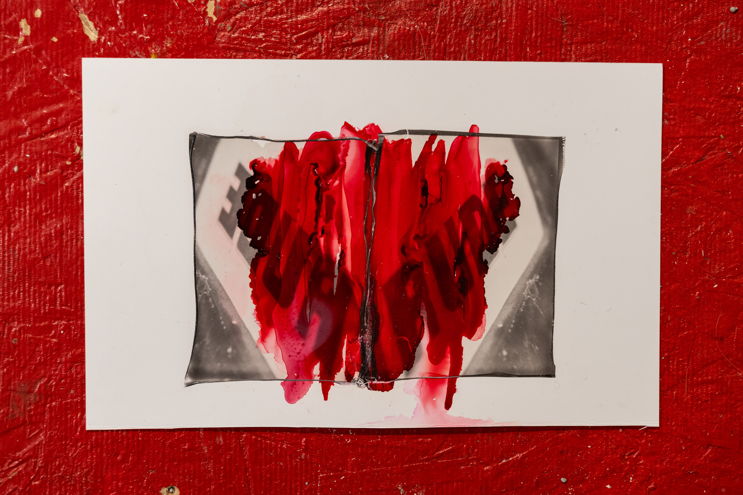
For the actual images in the body of the newspaper, I took the original pieces out into the field and photographed them on a variety of surfaces I found. Then I placed one photo on each panel of the newspaper. This is the first time I've used a broadsheet newspaper format, and I'm glad I did… it is so fun to see these large pages! I ended up having to darken the background of each image a bit because they were competing with the actual pieces from the project, but in the end I think I found a happy medium.
Limited Run - 20 Available
For now, I just did a limited run, but I'm very happy with the results. One thing that gets lost a bit is the brilliance of the color in the original pieces; it is newsprint after all, but the feel of it is great. I'll probably make a book for myself at some point to catalog the project (There are about 80 of them), but this has been a really fun way to present the project.
I have about 20 available if anyone is interested.
- 350x500mm Newspaper
- 16 Pages (Including Covers)
- 24 Featured Images (1/2 Page Each)
- 16 Additional Images (1/8 Page Each)
Thanks for looking!